BirdGpsExplorer
Aidan Slingsby
Homepage: http://www.staff.city.ac.uk/~sbbb717/
Email: a.slingsby@city.ac.uk
"BirdGpsExplorer" is research software for the interactive visual exploration of animal track data. The interactive visualisation techniques are described in the paper Exploratory Visual Analysis for Animal Movement Ecology. The software is written in Java, is free and loads data from a simple CSV format. I have been making improvements over the past decade, but it's still a bit buggy and making it suitable for others to use easily is tricky.
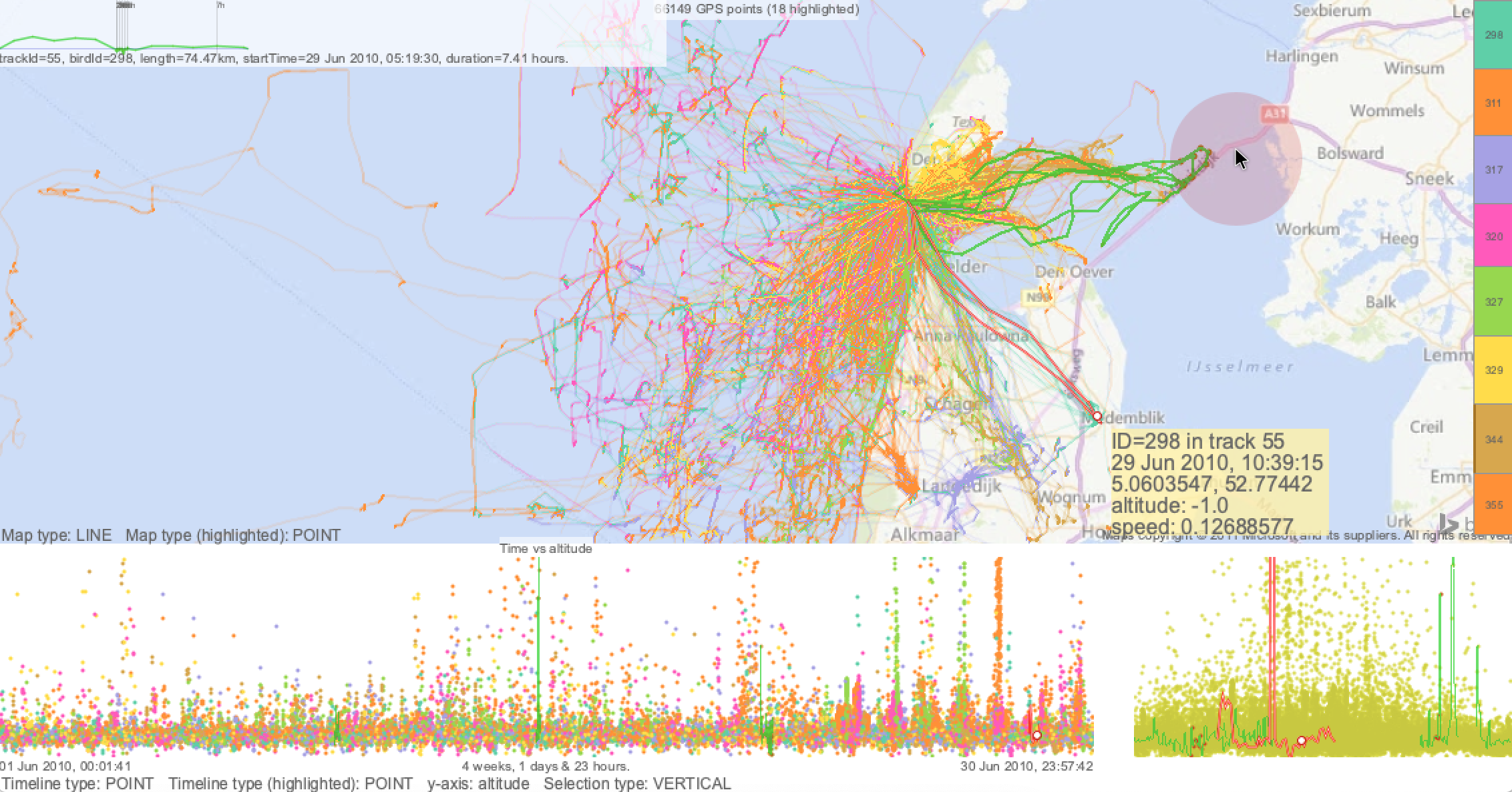
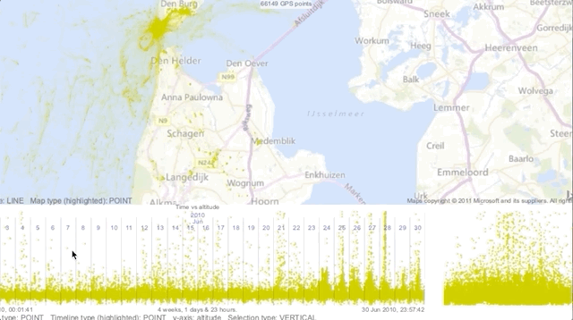
Example screenshot, in which points are interpolates into tracks where lightness indicates time-spent and hue indicates individuals. The red cicle is a transient brush which indicate the trips that touch it and are indicated on the timelines in red. See animated clip at the bottom of this page.
Get the software and try it out
The software download contains a readme.txt file with details of how to run it. Example data are provided - open all the CSV files at once in the data/ folder. The video (linked above) will give you an idea of how the interactions work.
Papers
The key publication is a 2016 EuroVis paper:
- Slingsby, A. & van Loon, E. 2016. Exploratory Visual Analysis for Animal Movement Ecology.
Case studies that use this software:
- Slingsby, A., Beecham, R. and Wood, J. 2013. Visual Analysis of Social Networks in Space and Time using Smartphone Logs
- Slingsby, A. and van Loon, E. 2017. Visual Characterisation of Temporal Occupancy for Movement Ecology.
- Slingsby, A. 2018. Tilemaps for Summarising Multivariate Geographical Variation.
Using your own data
The CSV file format is quite picky. Use the existing data as an example. The data can be all in one file or in several files and the order of the columns and rows does not matter, as long as columns have the correct names.
- The file should be a comma-, tab- or semicolon-separate value ASCII file.
- The first line must the column headings
- Essential column headings:
id,device_info_serial,object,object_id: for the ID of the individualdate_time,t,datetimeortimestampshould be in theyyyy-MM-dd HH:mm:ssformatx,longitude,lonorlong: Must be a longitude (WGS84)yorlatitudeorlat: Must be a latitude (WGS84)
- Optional column headings:
zoraltitudeorhorheight: height above sea level (map datum)spdorspeed: speedjourney_idortrip_id: unique key for a trip, uses to group points into trip (however you do this).- precede any columns with
c:: indicates an additional categorical column - precede any columns with
n:: indicates an additional numerical column
Using the software
Watching the video will help. In the software, pressing h will show/hide a concise help screen that provides all the necessary keystrokes.
Multiple coordinated views
There are three types of view:
- The map
- The timeline (at the bottom) with a diurnal timeline on the right
- Individuals in view (on the right of the map)
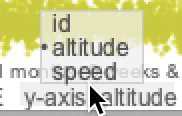 There are two timelines side-by-side. The wider timeline on the left shows the data points over linear time time using the x-axis; the narrower timeline on the right shows data points over a day. The y-axis is used to display other information, as indicated in the menu below the timeline labelled
 Y-axis pictured on the right. Click left/ right to cycle through the options and drag the mouse see the menu. The options are columns from the input file, including additional numerical and categorical variables that you might have added.
Zooming and panning
The same zoom/pan interactions apply to both the map and the timeline. You can zoom the map and timeline by using the scroll-wheel or right-click dragging the mouse in an up/down direction. You can pan the map and timeline by left-click dragging the mouse.
"Brushing" and animation
The same brushing interactions apply to both the map and the timeline. Brushing is where you can temporarily highlight data in one of the three views (map, timeline, individuals in view) and the corresponding data point appear (in red) in the other views.
Brush by holding down SHIFT as you move the mouse on either the map, the timeline or the list of individuals on the right of the screen. The corresponding data points will appear red in the other views. Releasing SHIFT will keep the brushed selection, enabling you to zoom and pan the map and timelines to identify when and where the selected data points are. For example, you brushing the map will let you identify when those data points in the brushed were, by looking at the red selection in the timeline. When SHIFT is pressed, LEFT/RIGHT will change the size of the brush (red circular area) on the map.
If tracks are defined (with the trip_id columns), pressing k will turn on/off these tracks when brushing.
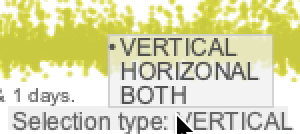 There are some additional brushing options for the timeline in the menu below the timeline, shown on the right. This enables to select a time range (
VERTICAL), select an attribute value range for the variable on the y-axis (HORIZONTAL) or both (BOTH). When SHIFT is pressed, you can use UP/DOWN/LEFT/RIGHT as appropriate to vary the width and height of the brush.
 |  |  |
You can animate through time by brushing the timeline (holding down SHIFT and mousing the mouse the timeline and pressing a to start/stop. The speed of animation depends on the zoom-level of the timeline. Zoom in to slow down the animation; zoom out to speed it up. To move the brushed area back into view, simply hold down SHIFT and move the mouse where to want it to be on the timeline.
Map and timeline types
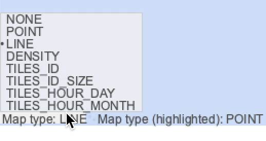 There are 7 types of map display type all with different advantages/disadvantages depending on what you are doing. There's a menu at the bottom left of the map. Left/right clicking cycles forwards/backwards through the option. If you drag the mouse, you'll get a popup menu as shown on the right.
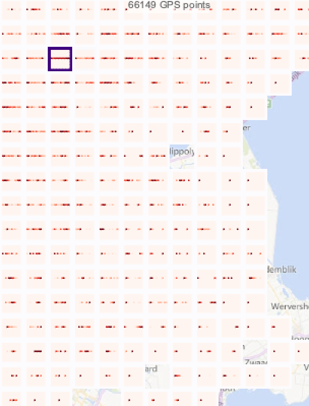
 | POINT: A dot for each GPS point. Good for showing raw data points, but incurs lots of occlusion and is a very poor indication of point density.
|
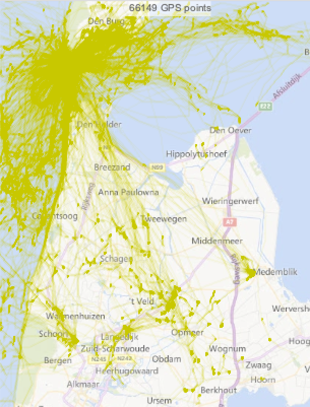 | LINE: Interpolates lines from the points and varies transparency based on amount of time spent there.
|
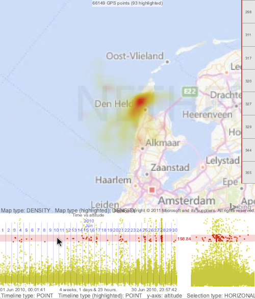
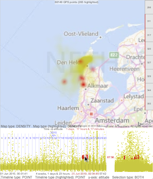
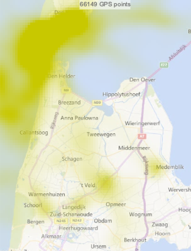 | DENSITY: Kernel density estimation (KDE) surface, based on amount of time spent there.
|
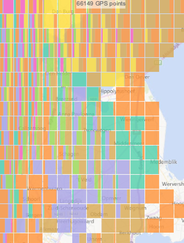 | TILES_ID: Tiles containing stacked barcharts indicating proportion of time the animals were in that grid cell.
|
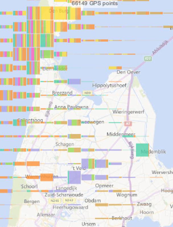 | TILES_ID_SIZE: As above - the width of bars is proportion of time animals spent there - but the height of the bars is the amount of time the animals spent there relative to other cells.
|
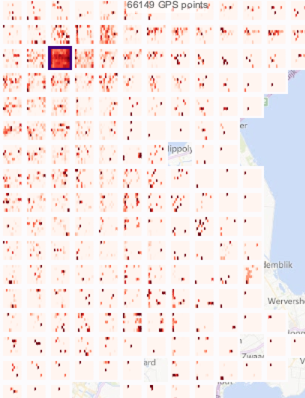 | TILES_HOUR_DAY: Indicates when animals have been in the grid square in terms of hour (columns) and day of the week (rows).
|
 | TILES_HOUR_MONTH: Indicates when animals have been in the grid square in terms of hour (columns) and month of the year (rows).
|
Note that the above applies to:
- The map (as shown above)
- The highlighted map layer (when brushing)
- The timeline (only the first three types shown above). See the drop-down menu at the bottom left of the timeline.
- The highlighted timeline layer (only the first three types shown above; when brushing). See the drop-down menu at the bottom left of the timeline.
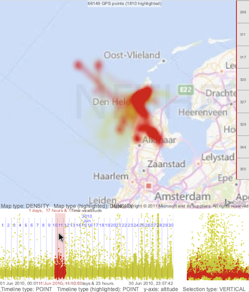
See below, where the map shows the data as a KDE surface and the highlighted data caused by brushing the individual is as a dot map.
.
Let me know how you get on
Happy to receive comments, bug reports and suggestions for improvements. I plan to continue to improve this page and improve the software. Do let me know if you find this useful, have comments/suggestions and/or want to collaborate. For example:
- Missing data and data quality analysis
- Alternative interpolation techniques
- Case studies involving other analytics tasks that need visual support
- Case study writeups
Acknowledgements
Early stages were funded by the EU-funded MOVE-COST Action (IC0903), with significant input from Emiel van Loon, Institute for Biodiversity and Ecosystem Dynamics (IBED), Faculty of Science at the University of Amsterdam.
If you find this page useful, do have a look at Exploratory Visual Analysis for Animal Movement Ecology which was presented at the Eurovis conference and is published in Computer Graphics Forum.
©Aidan Slingsby
31st January, 2021