How to read the OYTT chart
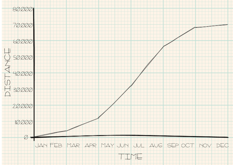
In 1939, Tommy Godwin rode 75,065 miles in one year. If you plot his progress as a graph
with time on the horizontal axis and distance ridden on the vertical, you get a line similar
to that shown to the left.
His progress started relatively slowly in the first couple of months before picking up over summer and then easing off towards the end of the year. Ths produces a characteristic 's' shape.
His progress started relatively slowly in the first couple of months before picking up over summer and then easing off towards the end of the year. Ths produces a characteristic 's' shape.
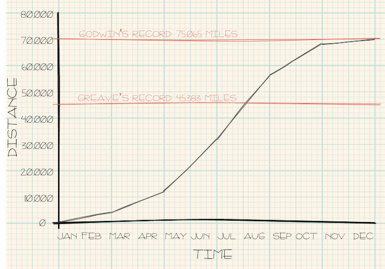
Any fixed distance plotted on this graph appears as a horizontal line.
Here Tommy's record distance is shown as the upper red line along with a 1936 previous record held by one-armed teeotal vegetarian socialist, Walter Greaves at 45,383 miles.
Here Tommy's record distance is shown as the upper red line along with a 1936 previous record held by one-armed teeotal vegetarian socialist, Walter Greaves at 45,383 miles.
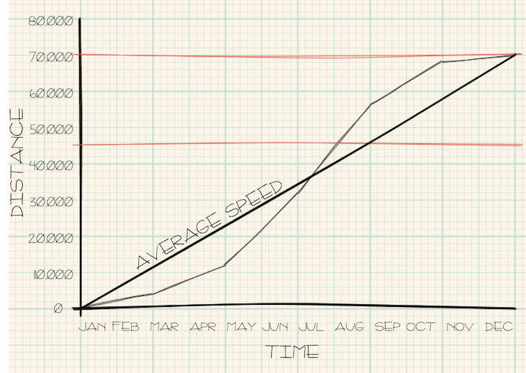
The steepness of the lines indicate speed. The average speed can therefore be shown by
drawing a line from the origin to the distance covered by the end of the year.
Here the thicker black line represents Tommy Godwin's average speed over the whole year (75,065 miles per year or a little over 205 miles per day).
Here the thicker black line represents Tommy Godwin's average speed over the whole year (75,065 miles per year or a little over 205 miles per day).
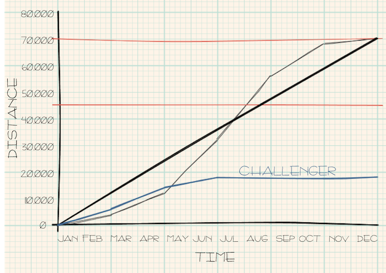
Here a 'challenger' is shown in blue riding further than Godwin in January and February (the blue line is above the grey).
In March and April, the challenger matches Godwin's speed but remains ahead; by May and June Tommy is riding at a faster pace. Where the lines cross in early May, Godwin 'overtakes' the challenger having covered a greater distance in the same time.
By July, the challenger stops riding and gains no further distance during the year.
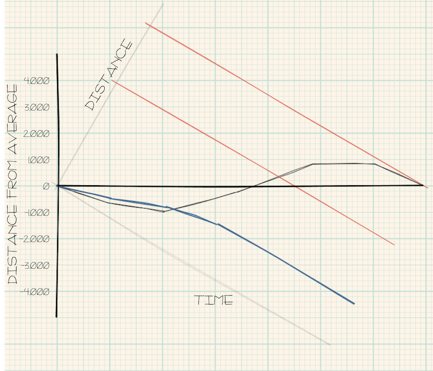
The 'OYTT chart' is as above, but to make comparison easier, the entire graph is rotated clockwise
so that the 'average speed line' of Tommy Godwin becomes horizontal. This allows all challengers to be shown relative
to that average speed.
Crossing lines still represent points in time when one rider overtakes another. Fixed distances are still shown as (red) straight lines, but now slope downward in line with the rotation of the chart.
Any rider who can finish the year above the thick black horizontal line will have beaten Tommy's record distance of 75,065 miles.